Web Design Trends 2012: Using Rich Textures
We have already told you that one of the Web Design Trends 2012 is using textures.
Textures are used in every sort of design. Nowadays you can see splendid textures used in business cards, mobile applications, and definitely in website designs. Appropriately used texture can help you achieve brilliant results by creating the realistic and detailed feel of web design. There exist minimalist, clean, subtle and grunge, each of them serving its purpose. Some people believe that the use of textures is characteristic of grunge designs, but here at Plumrocket.com, we are sure that any web design can be enriched by means of appropriates textures. This is because textures can both add visual interest to minimalist design, and that extra bit of detail that really makes an impressive design.
The most commonly used textures are paper, stone, concrete, rust, and fabric. Textured elements are used either as backgrounds or as additional details to accentuate what is relevant. The choice of texture usually depends on what kind of feel you are going to have: classic, grunge, professional, etc.
The usage of textures is extremely common and popular nowadays. This trend is expected to be in force in 2012 too. Let’s find out the reasons for such popularity.
First of all, rich textures can set the overall mood of the website and create a unique and individual web design. The main idea of using rich textures lies in letting your visitors “touch” your website. Any web design is expected to convey some message. And texture can easily enhance it, since the more senses you appeal to with your texture, the more impact on website visitors you have. A texture is a great tool for adding one more dimension to website design.
As a rule, textures are used as a background to make the website content easier to perceive and support the very tone of the design. But the latest samples contain textured elements in sidebars, footers, headers and other content areas.
Let’s have a look at the most inspiring textured website designs.
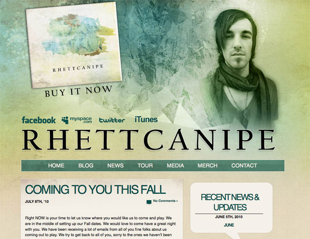
This sample is a classical use of textures to create a grunge look. However, the impact is intensified due to watercolor effects.
Here the spirit of vintage times is in the air, isn’t it…? The effect was achieved by mixing paper and cardboard textures.
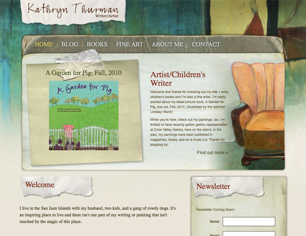
This textured design just shouts out aloud – “Eat me!”
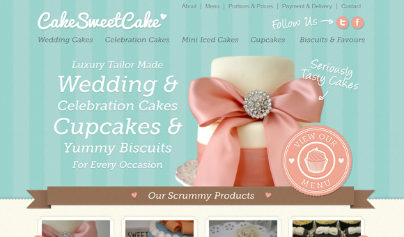
Color undertones + good choice of texture=simple but smart design!

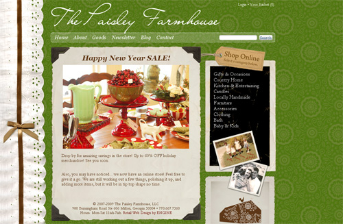
One more example of the use of rich textures…
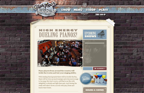
And finally, an extraordinary combination of rusted metal and bricks.
Of course, there are many more splendid examples of the use of rich textures. Web designers never stop working to impress both clients and users. The good thing is that both of them can only benefit from designers’ flight of fancy.
Feel free to share your favorites in the comments…

