Ecommerce Navigation in 2026: Examples & Best Practices

Navigation on the website is a critical thing for every ecommerce business. The way content is structured directly influences conversions, user satisfaction, and SEO of your website.
Effective ecommerce navigation isn’t just about menus—it’s about making shopping effortless. Tools like Magento 2 Layered Navigation extension provide advanced filters to help customers find products faster, while features like sticky menus and call-to-action buttons can guide them through your store seamlessly. But how do you decide which features will truly enhance the user experience?
In this guide, we’ll walk through ecommerce navigation best practices, real ecommerce navigation examples, and the latest UX trends for 2026 to help you design a structure that increases product discovery, engagement, and conversions.
Quick Post Navigation:
- How Navigation Impacts Conversions & Revenue
- Key Considerations Before Choosing Ecommerce Navigation
- What to Include in Your Ecommerce Navigation
- Top 5 Ecommerce Navigation Types & Examples
- Additional Features to Include in Your Ecommerce Navigation
- 2026 Navigation UX Trends to Watch
- Combining Menu Types for Optimal User Experience and SEO
How Navigation Impacts Conversions & Revenue
Ecommerce navigation has a direct impact on revenue. Multiple UX research studies clearly connect findability with conversions:
- Stores with optimized navigation typically see a 30–60% increase in conversion rates (Baymard)
- 69% of users rely on navigation or search as their primary method to find products
These numbers highlight that navigation goes far beyond visual design — it is a measurable conversion lever that directly influences shopping behavior.
Mobile continues to dominate ecommerce performance and user expectations:
- Mobile devices now drive nearly 80% of all retail website visits and 66% of orders (Statista)
- 58% of shoppers say mobile navigation is more difficult than desktop (Baymard)
This gap makes mobile-first navigation design essential rather than optional.
Key Considerations Before Choosing Ecommerce Navigation
There are many types of ecommerce navigation menus that you can use but not all of them can be helpful for visitors. Before choosing the menu, you can keep to simple criteria:
What Your Site is About
What do you sell? How deep is your product catalog? A store with thousands of products requires a fundamentally different navigation structure than a boutique store.
- Large catalogs → benefit from mega menus or vertical navigation
- Niche stores → more effective with simple horizontal menus with 5–7 top-level categories
Information pages (About, Blog, FAQs) may sit in secondary navigation or a footer to keep the primary menu focused on revenue-driving pages.
How Users Access the Site
It’s crucial to know what device your users access from as it determines which navigation to prioritize. For example, desktop users have more screen real estate, which allows using a horizontal menu with many categories. On the other hand, such menus can be inconvenient on mobile devices, so mobile users may benefit more from a hamburger menu. Ideally, your ecommerce website should accommodate both types of menus.
With mobile now responsible for the majority of ecommerce traffic and purchases, navigation must be especially optimized for smaller screens. In practice, this means you should:
- Simplify category depth
- Reduce the number of taps required to reach key products
- Use larger tap targets
- Prioritize sticky navigation on mobile where appropriate
- Combine search + categories for faster product discovery
How Users Engage With You
Analyzing how customers search for products can also help determine the right navigation. If the search is dominant, a prominent search bar might be more important than a complex menu. To determine what and where to place elements, you can use a heatmap, which shows exactly where users interact the most.
This will give you clear clues on how to:
- Rearrange menu items
- Highlight or demote certain categories
- Add visual cues (icons, labels, color accents) where users need more guidance
What to Include in Your Ecommerce Navigation
Primary Categories
Limit your main navigation to 5–7 primary categories.
Start creating the ecommerce navigation bar by defining the main sections, which typically represent the broadest groupings of your products. For example, a clothing store might have categories like “Men,” “Women,” “Kids,” and “Accessories.”
It’s crucial to keep the navigation bar simple and concise, so limit your categories to 5-7 primary categories at most. This approach helps prevent confusion and ensures that visitors can easily find what they’re looking for.
Transactional Links and a CTA Button
Transactional links, such as the shopping cart, user account, and key CTAs, guide users toward making a purchase. Optimizing their placement and functionality is crucial for driving conversions without overwhelming visitors.
Best practices include:
- Making the cart icon easily visible and accessible, usually in the top navigation bar
- Using hover-over details (on desktop) that provide a concise breakdown of items in the cart — quantity, price, thumbnails — so users can edit or remove items quickly
- Ensuring seamless access to the user account, where customers can log in, view and manage profile information, track orders, and adjust settings
A well-designed account area can significantly improve personalization and repeat purchases.
Calls to action are equally important. Links and buttons such as “Contact Us,” “Sign Up,” “Get Started,” “Special Offers,” or “Sale” should be clearly visible and visually distinct. Use contrasting colors or prominent button styles to make CTAs stand out from regular navigation links.
Search Bar
If your product catalog is quite extensive, it’s recommended to display a search bar at the top of your website’s navigation. A quick search functionality empowers users to find what they are looking for as fast as possible, leading to more conversions and sales.
When designing the search experience, make sure it is fast and genuinely useful for buyers. Ideally, it should:
- Include search autocomplete and suggestions that surface products as users type
- Show product thumbnails and brief descriptions in the search results
- Implement autocorrect and synonym handling to cover typos, misspellings, and related queries
Other Links
Some websites may require additional links due to their unique specialization or location. These can include links to secondary pages like “Delivery Information,” “Returns Policy,” “Language Options,” or “Currency Selector.” So, to keep your main navigation clear and focused, put these links in the footer or secondary navigation bar.
Top 5 Ecommerce Navigation Types & Examples
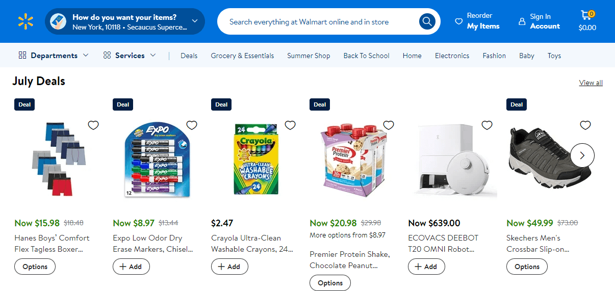
Horizontal Bar
The horizontal menu is one of the most frequently used ecommerce navigation menus as it’s straightforward and easy to use. The design of such a menu allows you to add any kind of content in the body of the page, while keeping the layout uncluttered on all devices.
Also, horizontal navigation keeps key product categories constantly visible at the top of the page, promoting easy access and discovery.
Vertical Menu
Vertical navigation, or sidebar, is also commonly used on different websites, but it is usually combined with the hamburger menu. The benefit of such an ecommerce navigation type is that it may contain many categories, which users can discover by scrolling down. Vertical navigation helps to save space on the screen, allowing the addition of valuable content.
Vertical menus are also a common way to display product filters. These filters help users narrow down their search results based on specific criteria like color, size, brand, or price. By providing a user-friendly filtering system through a vertical menu, you can significantly improve the browsing experience and help customers find exactly what they’re looking for.
Simplify Shopping with Advanced Filters
Let customers easily find products on your Magento 2 store with advanced filtering options like color, size, price, rating, etc. to increase conversions & sales.

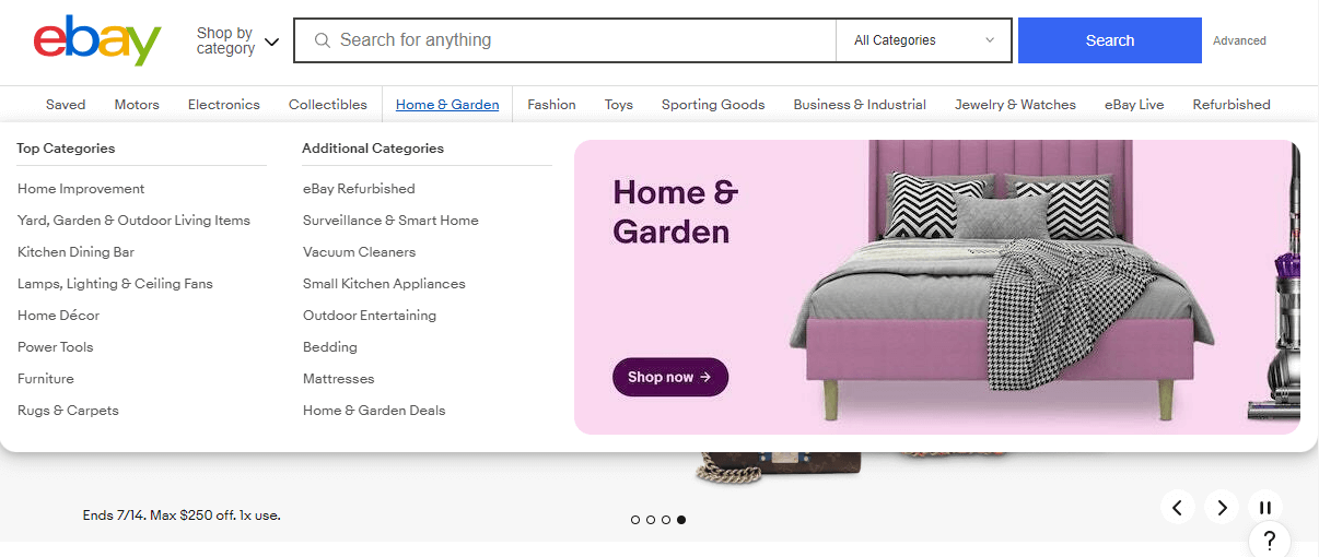
Mega Menu
A mega menu is very helpful if you have many items to offer. This type of navigation can help you visualize and structure all types of products. Thanks to its design, the website can be separated into categories with sub-menus to ensure correct navigation across a wide range of things. Also, unlike others, a mega menu allows you to add visuals, which makes the design more appealing.
This type of navigation helps big-sized websites to keep organized and consistent while proposing a big range of categories and items. However, carefully consider the size, nature, and purposes of your website to create really helpful and optimized navigation.
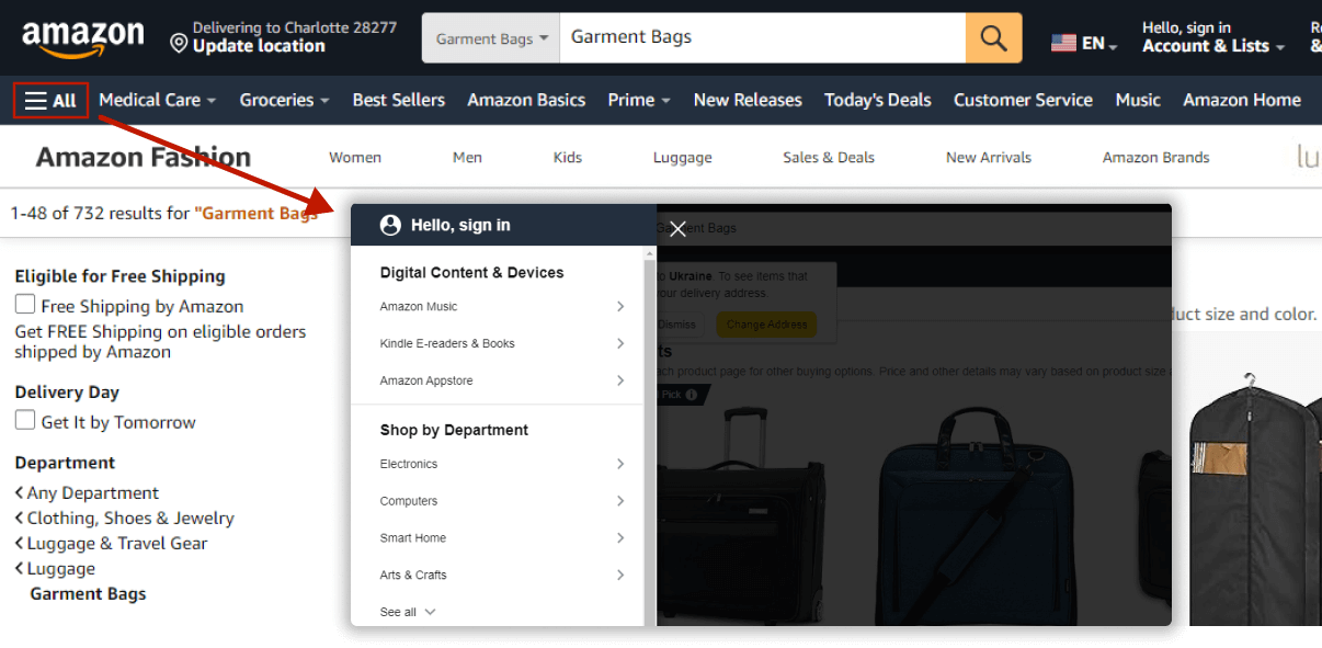
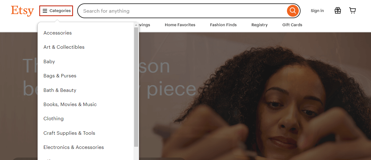
Hamburger Menu
This type of menu, known as the hamburger menu, is particularly appealing. It is commonly used on websites with limited space and on devices with small screens. Clicking on the icon with two or three dashes reveals the panel with categories.
The main aspect of this navigation is that you hide all categories in the hamburger menu to save space. However, these hidden categories might seem less important or be difficult to find for some users who are not familiar with the design of the hamburger menu.
Etsy found a solution by adding a description (“Categories”) next to the hamburger icon, which subconsciously encourages users to explore it. While this type of navigation is extremely helpful for websites that lack space, adding triggers like this can make it more effective.
Sticky Menu
A sticky menu or fixed menu is very convenient as it provides users with easily accessible navigation whenever they scroll. The main benefit of this ecommerce navigation menu is that it allows users to quickly and simply search for the necessary information or category.
However, it’s important to consider how a sticky menu may affect your overall design. While it promotes accessible navigation, it can occupy valuable screen space, especially on mobile devices. For mobile devices, you can implement a hamburger menu, which reveals a horizontal menu upon interaction and doesn’t take up much space.
Additionally, consider that sticky menus might not always match the content. For example, active animations could distract users from the navigation and make the menu inconvenient to use.
Additional Features to Include in Your Ecommerce Navigation
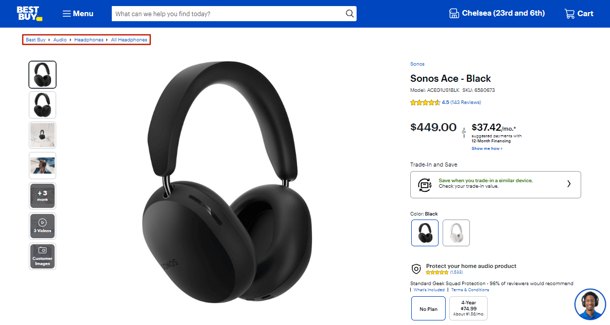
Breadcrumbs
Breadcrumbs are a very convenient type of navigation, but they shouldn’t serve as the primary one. This ecommerce navigation menu enhances both SEO and user experience. On complex websites, breadcrumbs act as a shortcut, allowing users to easily navigate the category hierarchy, saving clicks and time. Furthermore, they help search engines understand your website’s structure, which benefits SEO.
To implement breadcrumbs, it’s important to have a clear understanding of your website’s structure. Breadcrumb trails are linear, meaning they follow a single path of categories and subcategories. This limits the number of categories you can include in the breadcrumb navigation. Thus, consider breadcrumbs as a complementary navigation tool, designed to enhance the primary navigation system rather than replace it.
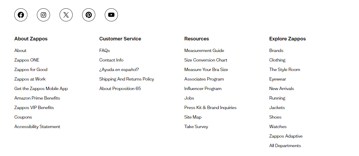
Footer Links
The footer menu is an important part of ecommerce navigation as it consists of essential links and categories. Typically, when users navigate to the footer menu, they are seeking information about the company or accessing other links related to products or services. Therefore, a well-structured and consistent footer is paramount for enhancing brand awareness and providing seamless navigation.
Key Elements of a Strong Footer Menu:
- Company Information links like “About Us” and “Careers” should be included in the footer menu to establish your brand and provide contact details.
- Customer Support links like “FAQs”, “Help Center”, and “Contact Information” guarantee that users can quickly locate support when they need it.
- Links to Marketing & Social Media icons provide access to your social media profiles while encouraging engagement and interaction.
- Policies & Trust Builders links to “Terms of Service”, “Privacy Policy”, and “Shipping & Returns” information provide transparency and build trust with customers
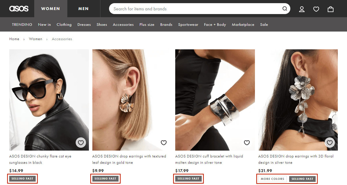
Product Labels
While product labels aren’t considered traditional navigation elements, they significantly help users browse through products. Among most used product label examples that speed up navigation and encourage purchases, we can highlight “Bestsellers”, “New”, “Free Shipping”, “Limited edition”, “Organic”, and other product attributes.
At the same time, product labels are used to draw customer attention to special offers and promotions. Labels, such as “Sale” or “Hot Deal”, are prominently displayed on the category page product images. They highlight items and inform shoppers about current promotions or the status of the product, which is really helpful for creating a sense of urgency and exclusivity.
For instance, Asos effectively locates product labels to prompt visitors to make purchases by highlighting special offers or new arrivals. This feature enhances product discovery on the website and, at that time, significantly improves customer experience and sales.
Read more: Top Ecommerce Product Badge Examples from Retailers
2026 Navigation UX Trends to Watch
As ecommerce continues to evolve, customer expectations around navigation are becoming more demanding. To keep your store competitive and user-friendly, consider incorporating these emerging navigation trends that will shape ecommerce in the future.
Mobile-First & Thumb-Zone Optimization
With mobile accounting for the majority of ecommerce traffic, designing navigation that feels natural for small screens is essential. Placing key menus and actions within the “thumb zone” helps users reach them comfortably, reduces friction, and decreases the likelihood of abandonment.

Predictive & Personalized Navigation
Modern ecommerce navigation is shifting toward personalization. More online stores are using machine learning to automatically highlight relevant categories, reorder menu items, or suggest products based on a shopper’s browsing behavior. This helps customers find what they’re looking for faster, improving engagement and conversions.
Integrated Voice Search on Mobile
Voice search continues to grow, especially on mobile devices. Adding a simple voice search icon to your navigation can improve accessibility and help customers discover products more easily—particularly when typing on a small screen is inconvenient.
Industry forecasts estimate that voice commerce will reach $45 billion by 2026.
Bottom Navigation Bars
Borrowed from mobile app design, bottom navigation bars are becoming increasingly popular on mobile ecommerce sites. They place essential links—such as Home, Search, Cart, and Account—within immediate reach, improving overall usability and encouraging faster browsing.

Combining Menu Types for Optimal User Experience and SEO
It is important to understand your website’s size and needs. For instance, small websites benefit from simple navigation, with categories that are readily visible and accessible. One of the most familiar and suitable menus for such businesses is a horizontal bar that keeps things clear and familiar for visitors.
On the other hand, mega menus, vertical menus, and hamburger menus are helpful for larger websites with plenty of product categories or content. These ecommerce navigation menus organize complex structures and help users find what they need.
The sticky menu is universal navigation, which optimizes the user experience for any website. It keeps essential categories and calls to action (CTAs) visible no matter where the user scrolls.
Often, combining a well-placed hamburger menu with a vertical navigation bar can be an effective strategy for improving a website’s user experience (UX). So, to reach the website’s full potential, carefully combine navigation types. Having well-organized and uncluttered navigation can significantly boost your website’s usability and effectiveness.