Web Design Trends 2011/2012 Part #1
Web design trends come and go. It’s difficult to predict the future of web design, but still, there are some changes that are worth talking about. Here we will tell you about current web design trends and explain the very concept behind each trend.
1. The priority of a website’s functionality over its graphics.
The beautiful design seems to be insufficient anymore. Think of the connection between the design and virtual reality of your website. Enchant your visitors by using a harmonious color scheme and intuitive design together with easily accessible information available to both desktop/laptop browsers, as well as smartphone and tablet browsers.
2. The use of HTML5 and CSS3.
In 2011 we witnessed an explosion in the use of CSS3 and HTML5. HTML5 is expected to replace some of the functions previously provided by Flash. With CSS3 you can make text shadows, border radius and image transparency without much difficulty. It’s time to get to know more about CSS3 and HTML5 now!
3. Using Sliders for Single Page Websites
Sliders are the web design trend of 2011. They are used when it is necessary to fit a lot of information on one web page. Instead of dragging the mouse over complicated navigation bars or menus, your visitors will only have to click on the arrow and your website will become an entertaining slide show. This illusion of a 3 dimensional space will capture your visitors’ attention. 3D effect can also highlight the most important part of your website, and hide less important in the distance. But don’t go too far with it, since it could be frustrating for some people.
4. Thinking about mobile-ready websites
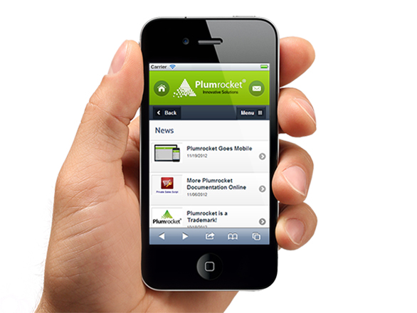
We have already mentioned the importance to adapt to the evolving world of mobile technology. Web designers must also accommodate to the needs and trends of mobile websites. The main task, of course, is to convert the original website design to its mobile version. Don’t forget that the text on a smartphone’s screen should be readable, and the icons – recognizable, colorful and striking.
5. Impressive Typography
Using various fonts in website design is another way to stand out. To combine bold letters and extra-large font sizes (slab typefaces) is likely to be the mainstream of website’s typography in 2012 – it grabs visitors’ attention and represents powerful identity behind your website.
Read more about Web Design Trends 2011/2012 in the next post


