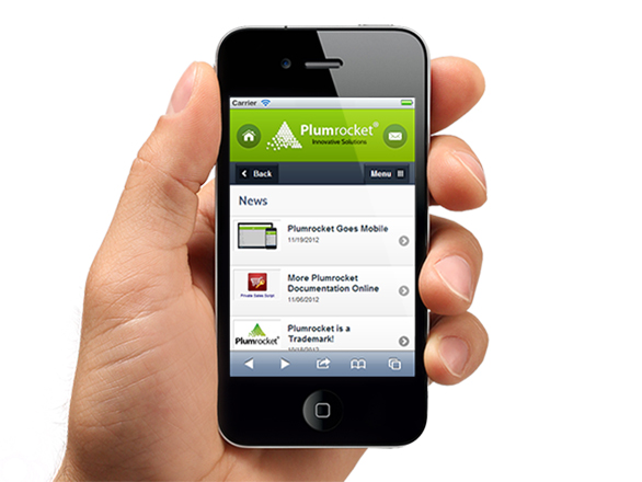
Mobile Web – Keep Moving Forward!
How many people do you know who don’t have a mobile phone? Your grandmother who prefers using her old phone? Your suspicious neighbour, whom you can only see through the window once in a while? (Don’t forget that the fact that you’ve never seen his mobile phone doesn’t mean that he doesn’t have one) Perhaps, your little niece – she has no phone because she is too small for that. Not many? And it’s not a surprise.
Today more and more people (students, secretaries and managers, housewives and directors) own a mobile phone. And each of them has something to look for in the World Wide Web.
Many companies provide mobile version of their websites because they don’t want to lose the opportunity to attract more customers.
It goes without saying that if you don’t want to lose in this competition, be sure to optimize your website for mobile phone users. The problem with traditional websites is that they are unsuitable for mobile viewing – you know, you have to wait for ages until the webpage is downloaded, and what you can see on the small screen is a bunch of jumbled navigation tools and images.
That’s why it’s so important to think of mobile web design.
How do you prepare your website for mobile users?
We’ll tell you what the mobile version of your website should contain. Usually mobile web sites have such architecture: Logo, website navigation, content, footer
- The most recognizable element of your company is your logo. So, make sure that a mobile user will see it on his screen. But remember that the size of this image should not be more than 2 Kb, otherwise, a mobile web browser will take too long to download it. And if you do want to put other images on your mobile website, it should be in .JPEG or .GIF or .PNG format as these files are rather light-weight.
- Then goes mobile website navigation. You need to provide the links to main pages or places on your website on this bar. We prefer it to be located at the top. Thorough navigation for your website is the main aspect of a mobile friendly website.
- Content is what people want – don’t forget about it. To be honest, it’s not so simple when talking about mobile web sites. On the one hand, the content of your website should be unique and fresh, and informative. On the other hand, you should not forget that it’s quite difficult to read a long article on a small screen of a mobile device. The possible way out we have to offer, is to compress your content to some major points but at the same time be sure to provide the user with the links to the main article.
- The last but not the least is the footer. Avoid using too many hyperlinks in your footer. Once again – small screens were not made for it! The same rule works with the excessive ads.
By the way, if you feel like trying to make a mobile version of website yourselves, check these resources. In case you need help with creating mobile websites consult the company specializing in mobile web development.
Interested in mobile website? You are welcome to contact us.

