Web Design Tips: How to Communicate Effectively via Headers
There are lots of tips aimed at helping you make your website better. Today we want you to pay special attention to headers. These are very important for effective communication since this is where visitors to your website will see what it is all about and whether they need you or not. So take your time to learn what makes a great header.
Traditionally, a header is where you place navigation buttons to make it easy for visitors to browse your site. But don’t forget that your header must be unique, have a personal and distinct look, be easily associated with your business or company. There should be a message directly telling the Internet audience why you are here to work for them.
Besides, there are a few more points to consider when creating a header.
- A header communicates the first impression – what mood/emotions is your header expected to evoke?
- What target audience are you looking for?
- Is your header different from the others?
- What pieces of content should be represented on the header?
Let’s try to find answers to these questions.
The First Impression
The very first impression shows the personality of the website and the team behind it. You can try including a tagline with a logo that says what your website is all about, or provide a small paragraph/phrase telling the visitors what this website is and who it is for.
The Mood
It is closely connected with the website objectives. For instance: if you work in the creative industry, a header should be creative too to impress and inspire newcomers. Meanwhile, a more technical or corporate website requires a straightforward, high-class header that is both aesthetically appealing, but yet fairly sophisticated.
Standing from the Crowd
It is important to make your header original and recognizable since this is how it is going to be remembered. That’s why a header is a prime place for the company logo, tagline, and all the other sorts of branding. If presented well enough, these will generate tight associations representing your website identity.
The Key Content for the Header
In general, the header should be quite simple in terms of content. We suggest using the following formula for a good header: a bit of promo content + a call for action + several navigation buttons.
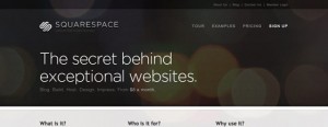
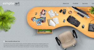
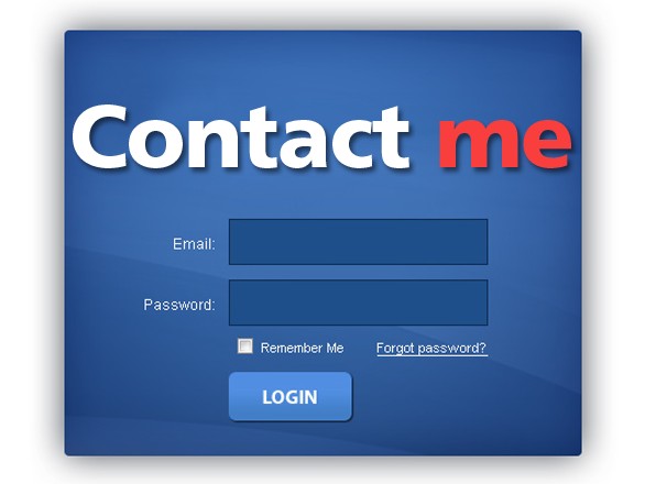
And now, let’s take a look at a few awesome headers to see their benefits for your inspiration.
Now that you know how to make a great header, go ahead with your own one!


