7 Secrets of a Good Website Layout
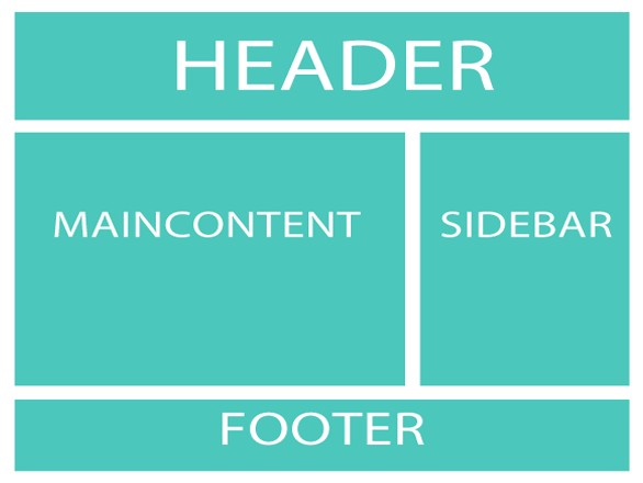
A good website layout is like a building plan. If you fail to cope with it, both you and your client will be dissatisfied.
Today, we would like to show you that a good layout presupposes good design, branding, readability, smart usability and, of course aesthetic appeal.
The elements of a website should not be scattered all over the page. They should be properly arranged to be both pleasant to look at and read.
So what are the secrets of a good website layout?
1. Important elements should be located on top. This is a must for all types of design (newspaper, website, print, etc.). When a person looks into a website he will immediately see the upper part. Place the important details here and don’t make the users scroll down the page to see it.
2. Do not cram your layout with too many details on just one page. This will make it difficult to navigate the website. Provide separate sections for different types of information you want to provide and make them accessible through internal linking. It is also important to use white space. This is a breathing space for all the website elements and it will make it easy for the eyes of the readers.
3. Be careful with graphics and images. You cannot just put them wherever you like. Graphics and images must support the context. It is hard to deny that a well-chosen image at the header or part of the post, as well as, a company logo make your website look professional and accomplished.
4. Alignment is the key feature of a balanced layout. To make your website look neat and organized, use a grid in order to have the elements of design properly placed. This is what many designers do to guide them to the perfect layout.

5. Provide a logical flow of information. Try using different colors and fonts to clearly determine the importance of every element of your website – headings, sections, titles, categories, etc should be presented in a logical manner. Note, that it is essential to select the right color combinations and contrasts.
6. Get rid of distracting elements. Too many ads, excessive use of flash and even horizontal scrolling can be really irritating for some visitors. That’s why you should avoid having distracting elements in your layout.
7. Web design protocols are to be followed. People get used to what they usually see. There are common norms of website lay-outing that should be followed to give your visitors a positive experience. For instance, underlined words with different color mean that there is a link in the text; or Home page, About and Contact page is what people usually look for in each website.
A good website layout can prevent the eye strain of the users. This can also help you increase traffic for the site. We hope that the tips provided above will help you achieve a better user experience.


